
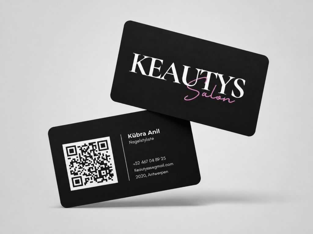
Keautys Nail Salon Branding
For this project, I created the visual identity for Keautys, a nail stylist and beauty salon. The goal was to design a brand that feels elegant, feminine and professional while also being visually appealing to the target audience.
The project focused on building a recognizable identity that could represent the salon consistently across different touchpoints. I wanted the brand to look stylish and modern, while still feeling approachable and personal. I began by designing the logo for Keautys. The aim was to create a refined and memorable wordmark that matched the beauty industry.
I combined a clean, elegant typography style with a softer script element to give the identity both professionalism and femininity. After defining the logo, I developed a matching business card. The card was designed to reflect the same visual identity through consistent colours, typography and layout. I chose a dark background combined with light and pink accents to create a luxurious and modern appearance.

Business Card and Final Result
An important feature of the business card is the QR code, which allows people to scan the card and go directly to the salon’s page. This makes the design not only visually attractive, but also practical and functional for marketing purposes.The final result is a cohesive branding concept that includes a logo and a professional business card, both designed to strengthen the salon’s identity and improve accessibility for clients. Through this project, I gained more experience in logo design, brand consistency and the creation of functional print materials for a beauty-related business.