
Frituur ’T Markt Branding
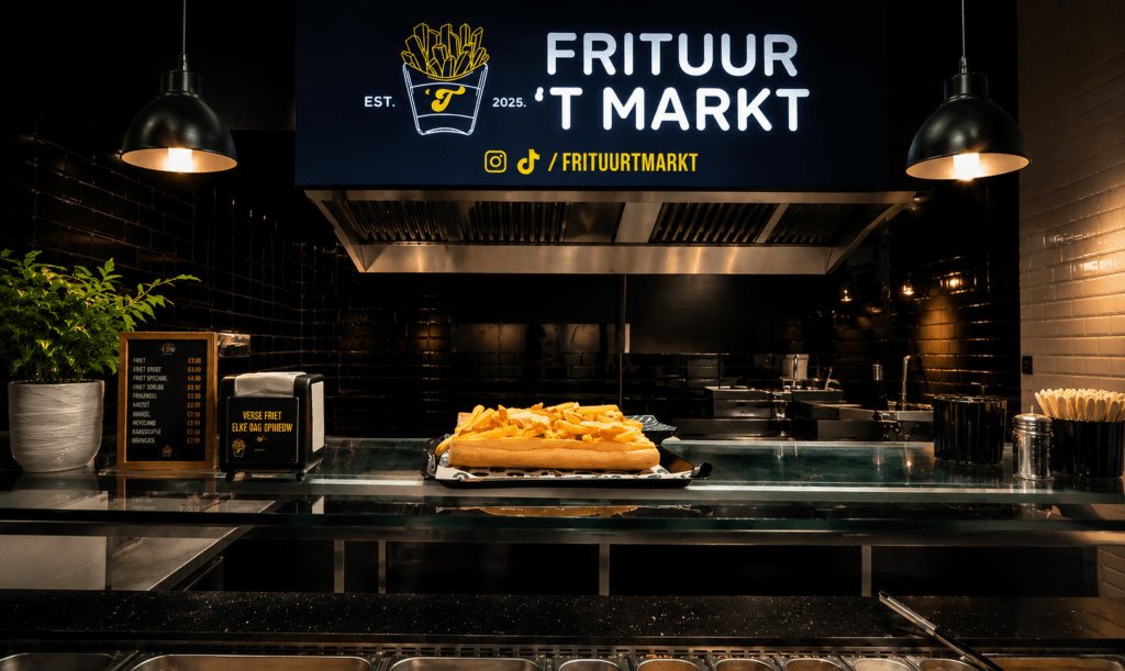
For this client project, I created the visual identity for Frituur ’T Markt, a snack bar that recently opened in Merksem. The goal was to develop a clear and recognisable brand identity that would suit the character of the business and attract customers in a local, approachable way.
The client needed a visual identity that felt professional, easy to recognise and suitable for use both inside and outside the shop. I started by designing the logo for the snack bar. The aim was to create a logo that immediately refers to the type of business while remaining simple, memorable and visually strong. After developing the logo, I applied the identity to different elements of the shop.
I designed the shop sign for the exterior and also created the counter board with the prices for inside the snack bar. It was important that these elements were not only visually consistent, but also easy to read for customers. I paid attention to typography, layout and clarity so that the branding would work effectively in a real commercial environment.

Final Result
The final result is a cohesive branding project that gives Frituur ’T Markt a professional and recognisable appearance. The logo helps establish the identity of the business, while the signage and price board support the customer experience and improve visual communication in the shop.Through this project, I gained more experience in designing for a real client, translating a business concept into a practical visual identity and applying branding across multiple touchpoints.